


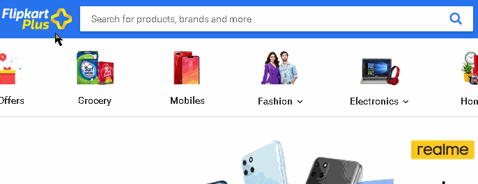
I was recently building an E-commerce app and making the search bar with a dropdown for suggestions was interesting. I tried to imitate the Flipkart Search bar in React and learned a lot along the way.
This article will be focused on how to make the dropdown, focus on the suggestions using the arrow keys and mouse hover, filtering and highlighting them based on the query. So if this seems interesting hop in.
Here's what we'll end up building: demo. Complete code available at the end.
Contents
- Features from Flipkart Search Bar
- Initial layout and Setup
- Creating the Dropdown
- Enable up/down keyboard focus
- Enable hover effect on suggestions
- Filter suggestion / history
- Format and highlight the suggestion
- Conclusion
Features from Flipkart Search Bar
Following were the features I tried to implement from the Flipkart search bar.
Dropdown context
First was the dropdown context that opens up on focusing the search bar.
Arrow Keys and Mouse Focus
Suggestions should be focused on when we use the Up ⇧ and Down ⇩ arrow keys. Focus starts with the Down ⇩ arrow. Change query based on which suggestion is being focused. Mouse hover to change focus as well.
Filter and Highlight Suggestions
Filter all suggestions based on the query being typed. From matching suggestions, highlight the part that doesn't match.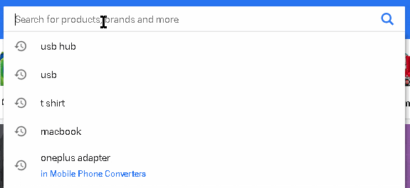
Initial layout and Setup
After observing the Flipkart search bar in the console. This was the initial component that I came up with. This Search bar is placed inside a header div and then CSS was applied accordingly.
const SearchBar = () => {
  // query 👇 inside input
  const [searchQuery, setSearchQuery] = useState("");
  const inputRef = useRef(null);

  const handleOnChange = (e) => {
    // 👇 update query when user types
    setSearchQuery(e.target.value);
  };

  const findSearchResults = (e) => {
    // 👇 stopped default navigate to /search?q=searchQuery based on form action
    e.preventDefault();
    // 👇 remove focus from input
    inputRef.current.blur();
  };

  return (
    <form
      className="search-form"
      action="/search"
      method="GET"
      onSubmit={findSearchResults}
    >
      <div className="search-bar">
        <input
          className="search-bar__input"
          type="text"
          name="q"
          placeholder="Search..."
          autoComplete="off"
          value={searchQuery}
          onChange={handleOnChange}
          ref={inputRef}
        />
        <button className="search-bar__submit-btn" type="submit">
          <svg></svg>
        </button>
      </div>
    </form>
  );
};
The basic structure will be a form with a search-bar div inside. Add a search icon SVG for the button.
Saving query in the local state using useState. Now to make the input work set an onChange handler and update the query state.
Also making use of useRef to keep a reference to the input dom element.
For the form, onSubmit we prevent the default behavior and remove focus from the input element.
Set autoComplete as off to stop the in-built browser auto-complete from old entries.
Additionally, if you want, you can also disable the button if the search query is empty.
The CSS is available in the sandbox. Just make sure to remove the border and outline from the input element.
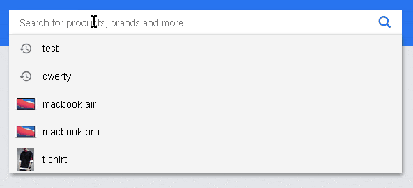
We get something like this:

In the next section, we'll add the dropdown inside form and see how to selectively display it on focus.
Creating the Dropdown
The dropdown will be represented by a ul element with a list item for each suggestion. This will be put inside the form. Form now has one search-bar div and another dropdown unordered list.
1. Show and Hide
This dropdown will be rendered conditionally in React based on a boolean variable called inFocus. This will be managed using useState. Whenever the user focuses on the input element(onFocus), the boolean will be set as true. When the focus leaves the input(onBlur), the boolean will be set as false. Whenever this boolean is true, a dropdown will be displayed.
const SearchBar = () => {
  const [searchQuery, setSearchQuery] = useState("");
  const inputRef = useRef(null);
  // manage when dropdown is in view 👇
  const [inFocus, setInFocus] = useState(false);

  const handleOnChange = (e) => {
    setSearchQuery(e.target.value);
  };

  const findSearchResults = (e) => {
    e.preventDefault();
    // 👇 hide dropdown on submit
    setInFocus(false);
    inputRef.current.blur();
  };

  return (
    <form
      className="search-form"
      action="/search"
      method="GET"
      onSubmit={findSearchResults}
    >
      <div className="search-bar">
        <input
          className="search-bar__input"
          type="text"
          name="q"
          placeholder="Search..."
          autoComplete="off"
          value={searchQuery}
          onChange={handleOnChange}
          ref={inputRef}
          onFocus={() => {
            // 👇 show dropdown on focus
            setInFocus(true);
          }}
          onBlur={() => {
            // 👇 hide dropdown when focus leaves
            setInFocus(false);
          }}
        />
        <button className="search-bar__submit-btn" type="submit">
          <svg></svg>
        </button>
      </div>
      {/* 👇 conditionally show dropdown */}
      {inFocus && (
        <ul className="dropdown">
          <li className="dropdown__item">
            <a className="item-link" href="/search?q=">
              <div className="search-suggestion-icon">
                <img src={"placeholder-icon"} alt="" />
              </div>
              <div className="search-suggestion-text">Suggestion One</div>
            </a>
          </li>
        </ul>
      )}
    </form>
  );
};
In the CSS for the dropdown make sure to remove the bullet points, extra margin, and padding that the browser adds. The dropdown needs to be absolutely positioned with a high z-index to display correctly. Also, remove anchor tag text-decoration and change back the color.
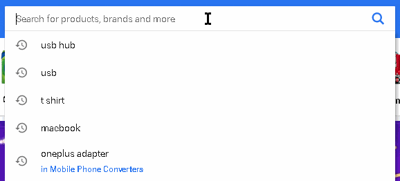
2. Display Suggestions dynamically
For this article, I've created dummy suggestions/history data with text and icon keys for each history item.
const initialHistory = [
  {
    text: "test",
    icon: "https://abc.com/test.png",
  },
  {
    text: "qwerty",
    icon: "https://abc.com/test.png",
  },
  {
    text: "macbook air",
    icon: "https://abc.com/mac.png",
  },
];
Import the array and save it in the state. Ideally, this history data comes from the backend.
import initialHistory from "./historyData";
All suggestions will be managed by filteredSuggestions useState with a limit of 8 total suggestions.
const [filteredSuggestions, setfilteredSuggestions] = useState(() =>
  initialHistory.slice(0, 8)
);
Passing a function inside useState is called lazy initialization . Runs the function only once during the initial mount. Doesn't really make a difference here though. Just something to know about.
Now to display the filtered suggestions, map over it and return li element for each suggestion.
{inFocus && (
        <ul className="dropdown">
          {filteredSuggestions.map(({ text, icon }, index) => (
            <li className="dropdown__item" key={"suggestion" + index}>
              <a className="item-link" href={`/search?q=${text}`}>
                <div className="search-suggestion-icon">
                  <img src={icon} alt="" />
                </div>
                <div className="search-suggestion-text">{text}</div>
              </a>
            </li>
          ))}
        </ul>
      )}
The argument in the map callback function is destructed and we take out the values we need. We should not use the index as a key. Ideally, we would get an id for the history item from the backend.
The anchor tag has an href of /search?q=userQuery so that on click we can get to the desired page. The q param is used as the name attribute of input is q.
Next, we need to add mouse and keyboard focus to the suggestions. So we can use the arrow keys and mouse to select the suggestion.
Enable up/down keyboard focus
Now for keyboard focus, we need some state to keep track of which suggestion is being focused on. When we focus on the suggestion, we want the query inside input to change as well.
const [activeIndex, setActiveIndex] = useState(-1);
This will be set initially as -1 to represent no selection. The value of activeIndex can be -1 or between 0 to filteredSuggestions.length, representing the index of selected suggestion.
1. Keydown Listener
We need to add a keydown listener to manage the Up ⇧, Down ⇩ arrow keys and Esc key.
In the input element's onKeyDown event pass the following function. This function will manage the necessary cases.
const handleKeyDown = (e) => {
  if (e.key === "ArrowDown" && activeIndex + 1 < filteredSuggestions.length) {
    // 👇 update active index value
    setActiveIndex(activeIndex + 1);
    // 👇 update query inside input
    setSearchQuery(filteredSuggestions[activeIndex + 1].text);
  } else if (e.key === "ArrowUp") {
    e.preventDefault(); // 👈 special case, see Note
    if (activeIndex - 1 >= 0) {
      // 👇 update active index value
      setActiveIndex(activeIndex - 1);
      // 👇 update query inside input
      setSearchQuery(filteredSuggestions[activeIndex - 1].text);
    }
  } else if (e.key === "Escape") {
    setActiveIndex(-1); // 👈 reset index
    setInFocus(false); // 👈 close dropdown
    inputRef.current.blur(); // 👈 remove focus from input
  }
};
There are 3 cases we need to handle on keyDown.
Down ⇩ Arrow
Keyboard focus only starts with the Down ⇩ arrow. Down ⇩ arrow means that we want to go down the suggestions. Essentially increasing the
activeIndexby 1. One thing to keep in mind is to add another condition and increaseactiveIndexonly ifactiveIndex + 1is less than the total length of suggestions available. So that we don't go out of bounds. In this case we also have to change the search query being displayed inside input tofilteredSuggestions[activeIndex + 1].text. Now we don't useactiveIndexdirectly butactiveIndex + 1as React does not immediately change the value but batches them together. So if we want to use the new active index we'll need to add one to the current active index.Up ⇧ Arrow
In the case of the Up ⇧ arrow, its means to go up the suggestions. Essentially decrease
activeIndexby 0. Similarly here also we need to make sureactiveIndexdoesn't go below 0. Again change the search query tofilteredSuggestions[activeIndex -1].Esc Key
In this case, we need to set the
activeIndexback to-1and close the dropdown by settinginFocustofalse. We can also remove focus from the search bar using the input reference we have.
Note: In the case of the Up ⇧ arrow, we have added e.preventDefault() to prevent an event fired by the browser, which causes the cursor to go to the start of the query inside the input element. There's a similar event on the Down ⇩ arrow which we have not stopped. It works perfectly for us, as want the cursor to be at the end of the query.
2. Cases where the focus needs to be reset
On Typing
Whenever the user starts typing(
onChange), we need to set theactiveIndexback to -1 so that focus is reset. So update theonChangehandler function.const handleOnChange = (e) => { setInFocus(true); setSearchQuery(e.target.value); setActiveIndex(-1); // 👈 reset focus };When focus enters or leaves the input element
Whenever users clicks on the input element(
onFocus) and when they remove focus from it(onBlur), theactiveIndexagain needs to be set as-1. Update theonFocusandonBlurhandlers on the input element.onFocus={() => { setActiveIndex(-1); // 👈 reset focus setInFocus(true); }} onBlur={() => { setActiveIndex(-1); // 👈 reset focus setInFocus(false); }}
3. Style Focused Suggestion
Now whenever a suggestion is focused, we need to emphasize it and style it differently from the usual list itemdropdown__item.
The suggestion is in focus only if the index of the list item is the same as the activeIndex. All we need to do is conditionally change the className of list item / suggestion whenever index === activeIndex.
<li
  // 👇 conditionally return different classes
  className={activeIndex === index ? "dropdown__item active" : "dropdown__item"}
  key={"suggestion" + index}
>
  <a className="item-link" href={`/search?q=${text}`}>
    <div className="search-suggestion-icon">
      <img src={icon} alt="" />
    </div>
    <div className="search-suggestion-text">{text}</div>
  </a>
</li>
Now we can target the focused suggestion in CSS using dropdown__item.active.
.dropdown__item.active {
  background-color: #2874f015;
}
.dropdown__item.active > a {
  color: #5a5a5a;
}
Using the arrow keys now works as expected.
Enable hover effect on suggestions
Mouse hover removes the keyboard focus and selects the suggestions based on which suggestion it's hovering over.
Mouse focus and keyboard focus are independent in Flipkart's search bar. Both can focus on different suggestions at the same time. This can be achieved by making another active index for mouse hover which will keep track of the suggestion being focussed on by the mouse. But to make it simpler, we'll be using the same activeIndex.
For this, all we need to do is update activeIndex to the list item's index in case it's hovering over the list item/suggestion. When the mouse moves out, reset it back to -1. We can use onMouseOver and onMouseOut events on the list item/suggestion.
<li
  className={activeIndex === index ? "dropdown__item active" : "dropdown__item"}
  key={"suggestion" + index}
  // 👇 on hover focus active, set to index value of li
  onMouseOver={() => setActiveIndex(index)}
  // 👇 reset focus
  onMouseOut={() => setActiveIndex(-1)}
>
  <a className="item-link" href={`/search?q=${text}`}>
    <div className="search-suggestion-icon">
      <img src={icon} alt="" />
    </div>
    <div className="search-suggestion-text">{text}</div>
  </a>
</li>
Moving the mouse on the suggestions highlights them accordingly.
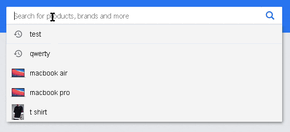
Now the focus works as expected, next is managing filteredSuggestions based on what is typed inside the input element(searchQuery).
Filter suggestion / history
Filter all history and get back matching suggestions only in the dropdown. We are only doing the match based on whether the suggestion starts with the query.
To do this we'll need to filter the suggestions whenever the user types something, so inside the onChange handler we'll need to filter them out and set a new filteredSuggestion array.
To filter the suggestion from the initialHistory data, we'll be creating a function. Add this inside the component.
const filterSuggestions = (query) => {
  return initialHistory
    .slice(0, 8)
    .filter(({ text }) => text.toLowerCase().startsWith(query.toLowerCase()));
};
What this function does is, takes in a query parameter and then filter out the suggestions inside initialHistory by checking whether the text key-value string starts with the query we have provided. startsWith is a string function and returns true or false accordingly. Also used toLowerCase() on both query and suggestion text, to do case insensitive matching. slice is used as we don't want more than 8 suggestions in the dropdown.
Next update the onChange handler to use the filter function we created and set the new suggestions that have been filtered.
const handleOnChange = (e) => {
  // 👇 filter suggestions based on query inside input
  const filteredHistory = filterSuggestions(e.target.value);
  // 👇 set new suggestions
  setfilteredSuggestions(filteredHistory);
  setInFocus(true);
  setActiveIndex(-1);
  setSearchQuery(e.target.value);
};
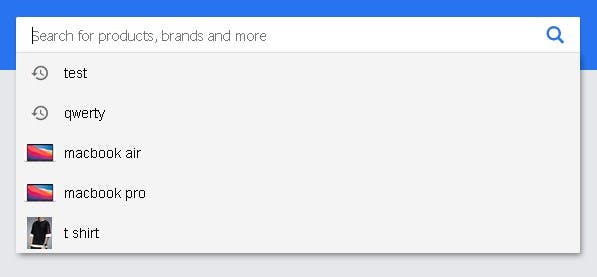
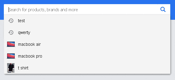
The filter works as expected:

Next, we need to highlight parts of the suggestion that do not match.
Format and highlight the suggestion
The part of the suggestion that matches should be light and following letters in bold.
To do this we'll create another function to format the suggestion text and send back JSX that highlights the suggestion according to the requirements.
const formatSuggestion = (suggestion) => {
  if (
    suggestion.toLowerCase().startsWith(searchQuery.toLowerCase()) &&
    searchQuery.length > 0
  ) {
    return (
      <>
        {/* 👇 matching substring */}
        <span className="light">
          {suggestion.substring(0, searchQuery.length)}
        </span>
        {/* 👇 not matched substring */}
        <span className="bold">{suggestion.substring(searchQuery.length)}</span>
      </>
    );
  } else {
    return suggestion;
  }
};
Now, this function accepts a string and checks whether the string starts with the current query(searchQuery) in a case-insensitive manner. We also need to put a special case of searchQuery not being empty, otherwise, it'll return true every time.
As we know the suggestions are filtered based on whether they start with the query string, to get the matched substring all we need to do is take out the substring from the start(0) to searchQuery.length. We are not using searchQuery directly here, as the suggestions and query cases may be different (because of the case-insensitive filtering that we did).
To get the part that does not match, we just need the substring starting from the searchQuery.length position to the end.
The matching substring is wrapped in span elements with the class name light, the following substring that does not match the query is wrapped similarly in a span with the class name bold.
Else condition is for when the suggestions are not filtered. This only happens when the searchQuery is empty.
To use the function, we'll need to update the list item(dropdown__item) and format the suggestion text inside by passing it this function.
<li
  className={activeIndex === index ? "dropdown__item active" : "dropdown__item"}
  key={"suggestion" + index}
  onMouseOver={() => setActiveIndex(index)}
  onMouseOut={() => setActiveIndex(-1)}
>
  <a className="item-link" href={`/search?q=${text}`}>
    <div className="search-suggestion-icon">
      <img src={icon} alt="" />
    </div>
    <div className="search-suggestion-text">
      // 👇 format suggestion and return modified jsx
      {formatSuggestion(text)}
    </div>
  </a>
</li>
Highlight in action:
Conclusion
Whew! We are finally done. I tried my best to make it work similar to Flipkart.
The complete code is available in the sandbox below:
The search bar works based on the query param q sent in the URL, similar to Flipkart. Both clicking on the suggestion or submitting the form navigates to /search?q=searchQuery. In the case of form submission, we have stopped this using e.preventDefault().
There is more stuff that can be added. The searchQuery should be initialized by whatever is sent in the q param, based on which the search results will be displayed.
We can further add inputs to history/suggestions, get debounced suggestions from some backend API when the user types(onChange), use encodeURIComponent to encode query string parameters, etc.
But this seems more than enough for one blog 😅. Thanks for reading through this! If you found this helpful, leave a like. Feedback and any corrections are appreciated.